Memory Book App
Honor the legacy of cherished family members and friends.

Project Impact: The final iteration improved KPI (the task completion time) by 50%.
Project duration: 4 months.
My responsibilities: UX Research, UI/UX Design, usability studies, iteration, final version, and deliverables.
Tools: Figma, Miro, Zeplin.
Problem Overview and Background
Death is a normal part of life and yet it is one of the most challenging emotions. When a loved one dies, people long to receive photos and stories they have not seen or heard before. They often want to create a personalized memory book.
However, available online platforms lack an integrated approach to cover every step from collecting and sharing memories to creating a memory book.
With this study, I designed a mobile application where users can effortlessly gather stories and photos and create an aesthetically pleasing book of memories. This platform supports those grieving by honoring the legacy of cherished family members and friends.

Problem statement
Research goals
Research plan
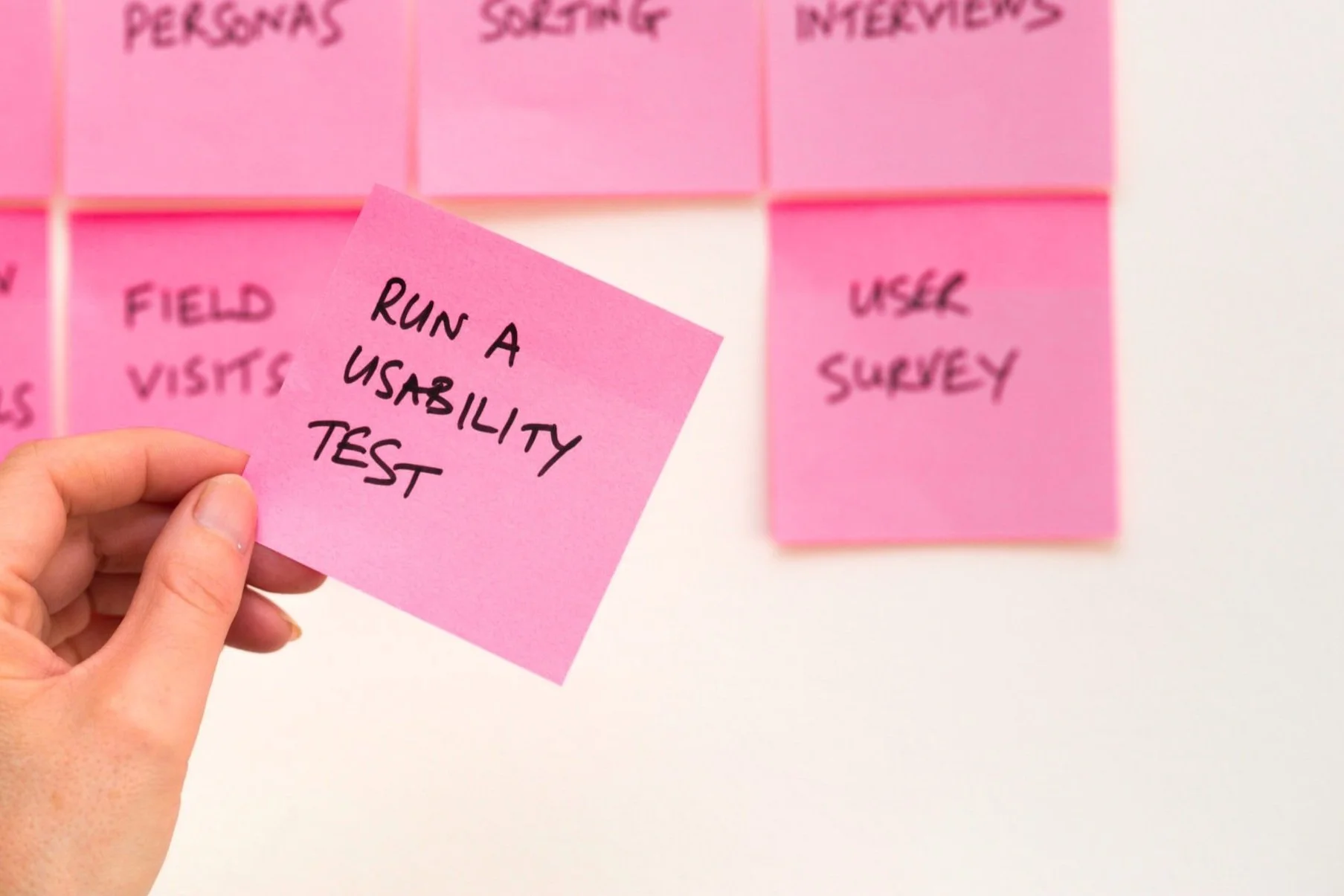
DISCOVERY

Participant recruitment
One-to-one user interviews
RESEARCH

Qualitative and quantitative analysis
Research report
ANALYSIS

Feature ideation
User-flows
Sketching
IDEATION

Wireframes
High-fidelity design
Interactive prototype
DESIGN

UI elements and design
User journey
Visual mockup
End-to-end design process details followed in this project.
DELIVER
User interviews
Remote usability sessions
TESTING
Design Process


This was an end-to-end design project. I created all the key design elements from research to sketching to usability studies to a final iteration.
Affinity Diagram
Affinity Diagram showcasing data insights derived from UX Research interviews for comprehensive analysis and synthesis.
Research Goal
Understand the user needs and current pain points with existing products to create a pleasant experience of gathering memories and creating a memory book.
Research Participants
Recruited three participants by creating a post in a social media group of young widows.
Key Research Insights
All participants used multiple platforms to create their project and found it laborious.
2/3 participants were exhausted from sending reminder messages to have friends share media files or stories.
Online photo-sharing platforms put a quota limit or are not easy for sharing media files.
All participants wanted to include sympathy cards or handwritten letters in their memory book project, however, they were not able to do that easily.
Discovery & Research
Ideation
Brainstorming
I prioritize the following features:
Create a new memory book project as a project admin to collect photos and stories.
Search an existing memory book project and share photos and stories as a non-admin user.
Admin has certain privileges: sending invitations, setting up automated reminders, and exporting photos and memories together as a digital copy.
Initial Crazy-8 sketches of Memory Book mobile application.

Design & Testing & Iteration
I created the first design in lo-fi, then continuously iterated with clickable hi-fi design features based on user feedback.
Low-fidelity Prototype & Usability Study
Low-fidelity prototype with a visual representation of the user flow for early-stage testing and validation of design concepts.
I performed a one-on-one usability session over Zoom covering prearranged tasks on the mobile application.
Usability session findings
• The memory book project list on the main view was not clear due to the layout.
• Confusion about the user’s role in different memory book projects. Users have an admin role if they initiated the project, however, this was not clear.
• Small button sizes were difficult to read, and some texts were not descriptive.
• Sign-out was not intuitive.
High-fidelity Prototype & Usability Testing
A new iteration of the mobile app design: High-fidelity Figma prototypes for detailed visual representation and user testing
Unmoderated usability study findings
Critical problem: The confusion about the users' role in memory book projects persists. The tab view for the “Manage” and “Contribute” options are not intuitive to distinguish between being an admin and being a contributor to a project.
Most users naturally clicked on the project name rather than the ‘go arrow’.
Going back to the home page from the project view was not intuitive.
New iteration with high-fidelity features
Designed a logo and launch screen for the app, and chose bright colors.
Revised the layout and provided descriptive wording to overcome confusion on users' roles on memory book projects from the list.
Implemented a simple user flow by using CTA buttons and icons that users are already comfortable with.

Major Design Problem & Solution
Problem:
Confusion about users' role in the projects.
Solution:
Iterate the design: Ensure intuitive distinction of users' admin status.
The user is:
the owner (admin) of a memory book project when s/he initiated the project.
the contributor (non-admin) of a project when the project was initiated by others.

Step 1
Added onboarding pages to build a better understanding of users' roles on projects.
Onboarding page prototypes to ensure a smooth and engaging introduction to the platform.
Step 2
Removed the tab view and made the ‘admin names’ as part of each project item.
The high-fidelity prototype of the main view with the redesigned user interface after removing the tab view.
Step 3
Added the bottom navigation with the “+ Add Project” CTA button, such that the user chooses to “create a new project” or “search an existing project”.
The main view displays an actionable CTA button for adding a new memory book project.
Final Iteration & Impact Overview
The design solution and final iteration strongly resonated with two users via usability interviews:
Both users reported that the final design improved greatly over the prior high-fidelity prototype.
The final iteration improved KPI (the task completion time) by 50%.
They both found that the new design is easy to use and yields a thorough and pleasant experience.
Enjoy my app!
Functional Prototype
Deliverables to Engineers
User-journey


UI Elements
Visual mockup